
![[object Object]](/static/d95f1fffaf19f1d12b7f41ca0c371fd6/cc834/Dorothy-Music-Info-1024x766-1.webp)
![[object Object]](/static/11d35c326b5ec7359ad94b8e0a750d47/cc834/overload_original.webp)

Improve Your Conversion Rate in less than 5 Minutes
CRO
Infographics, when done well, are a complete time sink that miraculously steal your time to educate you on something you never knew you wanted to know. Done badly, a totally forgettable image that makes the page load way too slowly.
They’re universally appreciated too, they work on social media, they build SEO links, drive traffic, impart crucial information and look cool. It’s a win all round!
You know a good one when you see it, but how do you even begin to brief for a good one? Well, we’ve reeled in three of our all-time favourite infographics, each of which teaches us a lesson about making these bad boys.
Sounds obvious but no one is going to pay attention to something that is about as exciting as watching your grass growing. Let’s face it, not every business is obviously thrilling to the masses, although this is why you pay for good creative work. Because there is always a way to pull out and broadcast what makes your company interesting.
The infographic below is a great example of this, created for poster printers (not exactly a show stopper in terms of excitement) ‘We Are Dorothy’. By taking the time to extract what the service really offers its customers and then picking the most universally interesting product, this infographic went viral.
Want to know a brutal truth? It doesn’t matter how good your idea is, if it’s executed poorly no one will give it the attention it needs. Historically, even bad ideas executed really well gain traction (Just look at Donald Trump). So you need to make sure no matter what your objective. EXECUTE. WELL. DAMN WELL.
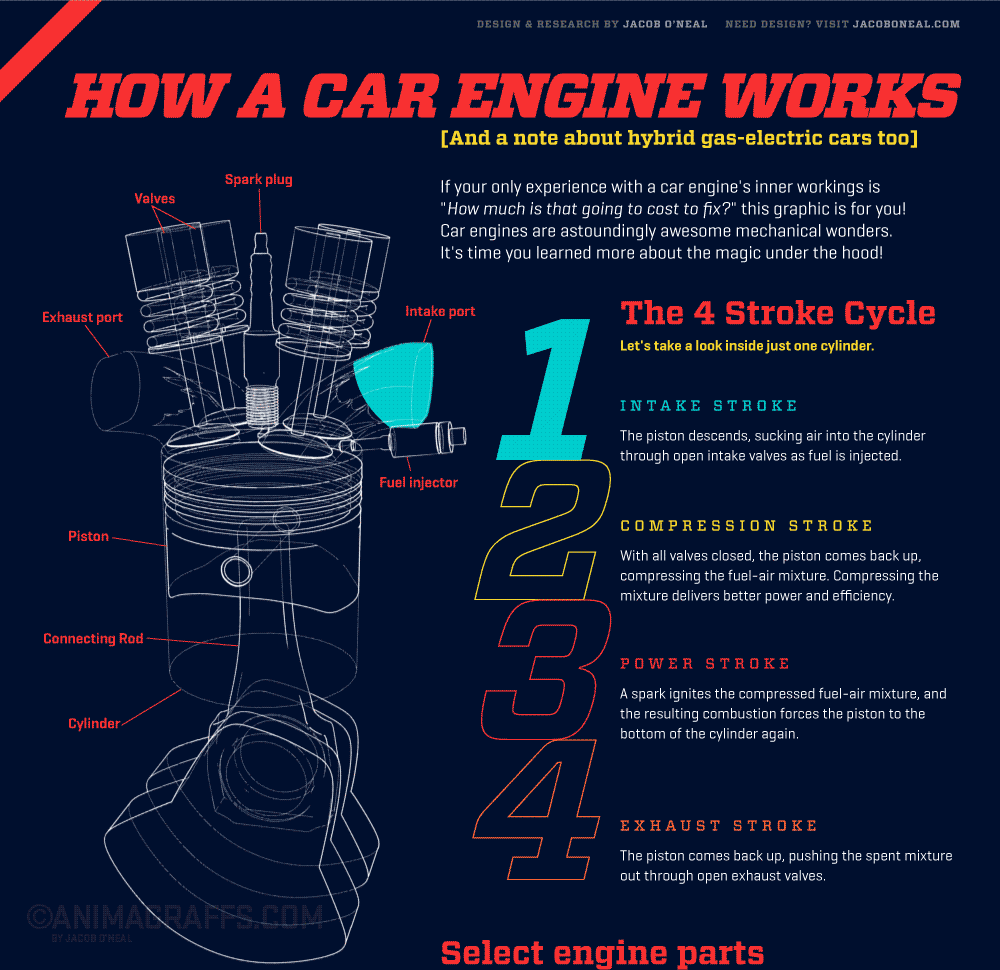
This comes as no finer example than this infographic, it’s the inner workings of the internal combustion engine. For many people not a process they understood or even knew they wanted to know. After you arrive at this infographic you’re sucked in and come out educated on the other side. This is down to the outstanding execution, it’s quite a complex journey but through the great use of animation, diagrams and the right pieces of text. Voila, you’re educated! (click the image to see it!)
Now, you might think the following image barely qualifies as an infographic. However, it achieves its objective in imparting the right knowledge onto its reader in record time. Now it could go on to use examples, figures and images, however that would remove the simplicity here that makes it a universal truth.
It’s called the production triangle but people will know it through many different names (Shout to all you people working in agency land!). The idea is if you want to get something made or done, you can only pick two of the options in the graphic.
It’s relatable, it’s easy to understand, it’s evergreen. They’re the magical ingredients to making great content. The lesson is use the right amount of information – not too much, not too little.
With these lessons in hand, go out into the world to create great things or get us to create them for you! Also, we hoped you enjoyed the image of the dog, we definitely did.
Until next time.
